What I Learned from the Prototype
Recently I received the first prototype for Electoral Barrage. After opening the box and enjoying the experience I started to notice some issues. I emailed the printing company with my concerns and they gave me a very detailed response back. Here is what I learned:
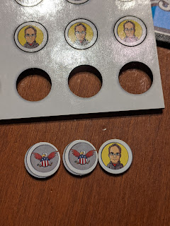
As you'll notice the front of each Delegate (chit) looks great. However, the back is off centered. When the back sheet was cut it was not perfectly aligned. It seems that this is completely normal in the printing business. In fact it can be off up to 1/8" and still be considered normal!
Since the chit has a border it makes it much more obvious when it is not centered. To accommodate "printing drift" I removed the border around the edge. Now if the cut is not perfect it will be much less obvious.
Here is a video that the printer made on this subject:
https://youtu.be/-bT59XmvJ_s
https://youtu.be/-bT59XmvJ_s
The cards look great and the colors pop. Upon closer inspection at the top edge of the card you'll see "edge chipping". This happens when the card is cut. Again, this is a standard thing that happens for them.
The card stock itself is a white color. Therefore, to minimize the chipping effect a light border is recommended. I'm still thinking about this as I really like the look of the card right now.
As I mentioned in the last update I am really happy with the Staffers (Meeple / Peoples). While I was looking that them the red ones caught my eye. The red ones were skinnier! Did all the red ones diet on the way over? :-)
I asked the printer about this as well. The pieces can vary slightly. This is a shame as I would have really like them all to be the same shape.
Two other quick points:
- They do not offer an option to pre-wipe the soot off of the cards. Therefore, I have to expect those that buy the game to do so. It is not a big deal, but I have never heard of a game that made you clean it. The soot did get all over the cloth that I used to clean them. So it really needs to be done or you could get something very dirty.
- The colors looked much darker in print than on the computer screen. Again this seems to be a standard thing in the industry. The printer company recommended adding a 20% brightness filter to all colors. I ordered some sample color swatches so that I can match the print color with the computer.


Comments
Post a Comment