Campaign Card Updates
The engine of change has been in full swing. The graphics and mechanics keep getting tweaked and modified. I have made many great suggestions by many playtesters and game designers. With each suggestion comes a lot of work to realize it.
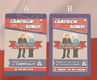
Lately I have been focusing on the layout of the cards. The original layout was set by the graphic design artist that I hired do lay them out. There was a lot of great feedback about them, however, I was looking for a slightly more modern look now that the game has matured. Also, when the card gets printed the bleed edge gets cut off. If the card has a frame then is more noticeable if the cut is not perfectly centered. Therefore, the frame had to go. I ran a poll to see which design looks better. It got about 90% for Design A and only 10% for Design B.Which do you like better?
Here you can see that the spacing is set to 11 pt. Now nothing touches!
If you have any ideas I would love to hear it!
You may have been keen to notice already that the newer designs now contain the key pieces of information with a different font. This helps to make the card to more readable. The text looks like it is bolded, but really it is a different font entirely. Interestingly, the bold font is 7 pt. and the other font is larger at 8 pt.
Thanks for stopping by! Please contact if you want a playtest, have any ideas, or just want to leave some feedback.


This is really informative blog, I have to thank for your efforts. Waiting for more post like this.
ReplyDeleteOnline Graphic Design Courses With Certificates
Best Online Graphic design courses